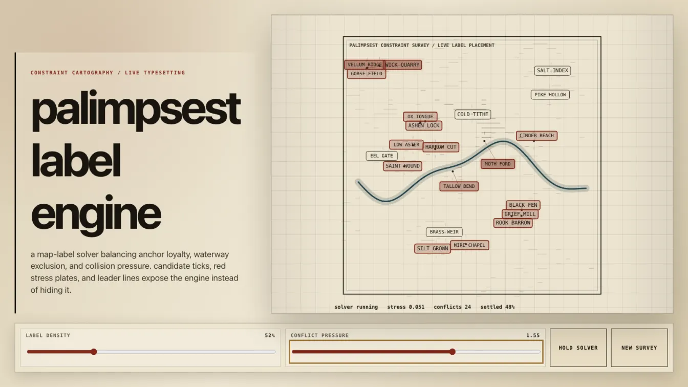
Palimpsest Label Engine turns a map-labeling problem into a visible constraint fight. The app renders a procedural survey sheet, then lets each place name negotiate between where it wants to be and where the map will actually allow it to survive.
The useful part is the exposed pressure field. Labels never snap into a tidy final layout. They pull toward their anchor points, repel from other labels, clamp against the viewport, avoid waterway geometry, and drag leader lines behind them when the solver has to compromise. Red stress plates show the places where the system is still losing the argument.
The build has three interacting systems:
- A constraint solver for map labels with overlap repulsion, anchor attraction, boundary clamping, and waterway exclusion.
- A procedural cartographic renderer with evolving river geometry, contour fields, leader lines, candidate ticks, and oxidized red conflict annotations.
- A responsive control surface with live numeric outputs, keyboard controls, mobile layout checks, and proof capture automation.
The controls are deliberately boring in the best way. You can tune solver force, anchor loyalty, exclusion strength, and label density without opening devtools or pretending a canvas demo is an instrument only the author can play. The numeric outputs make the state legible: collisions, pressure, settled labels, and constraint balance update as the field changes.
Canvas 2D is the right tool here. WebGL would make the demo look more expensive and solve exactly none of the actual problem. This is typography, geometry, hit boxes, leader lines, and layered ink. The implementation benefits from immediate-mode drawing because the map is a living worksheet, not a mesh pretending to be terrain.
The main tradeoff is legibility versus motion. Label-placement systems become unreadable fast if every candidate buzzes around like caffeinated UI confetti. This one keeps the pacing slower and lets the solver breathe. You can see individual compromises form instead of watching a swarm collapse into decorative noise.
The aesthetic stays in surveyor-paper territory: black ink, brass-gray controls, contour scars, red conflict marks. No neon radar cosplay. No fake cyberpunk glow. The whole thing feels more like a field notebook arguing with a typesetting engine, which is exactly where a cartographic constraint demo should live.
The result is a small interactive machine for a problem most interfaces hide after the fact. Good map labels look inevitable. This build shows the ugly little physics that makes them earn it.