The Build
Micrographics Lab is the second pass at the monochrome HUD generator. The first one had the right obsession and the wrong discipline: dense panels, mixed scripts, procedural readouts, and a good ink-on-paper palette, but it drifted into tile confetti and mobile got ugly fast.
This version is less impressed with itself. It cuts harder.
What Changed
The old build was a generator. This one is closer to an instrument.
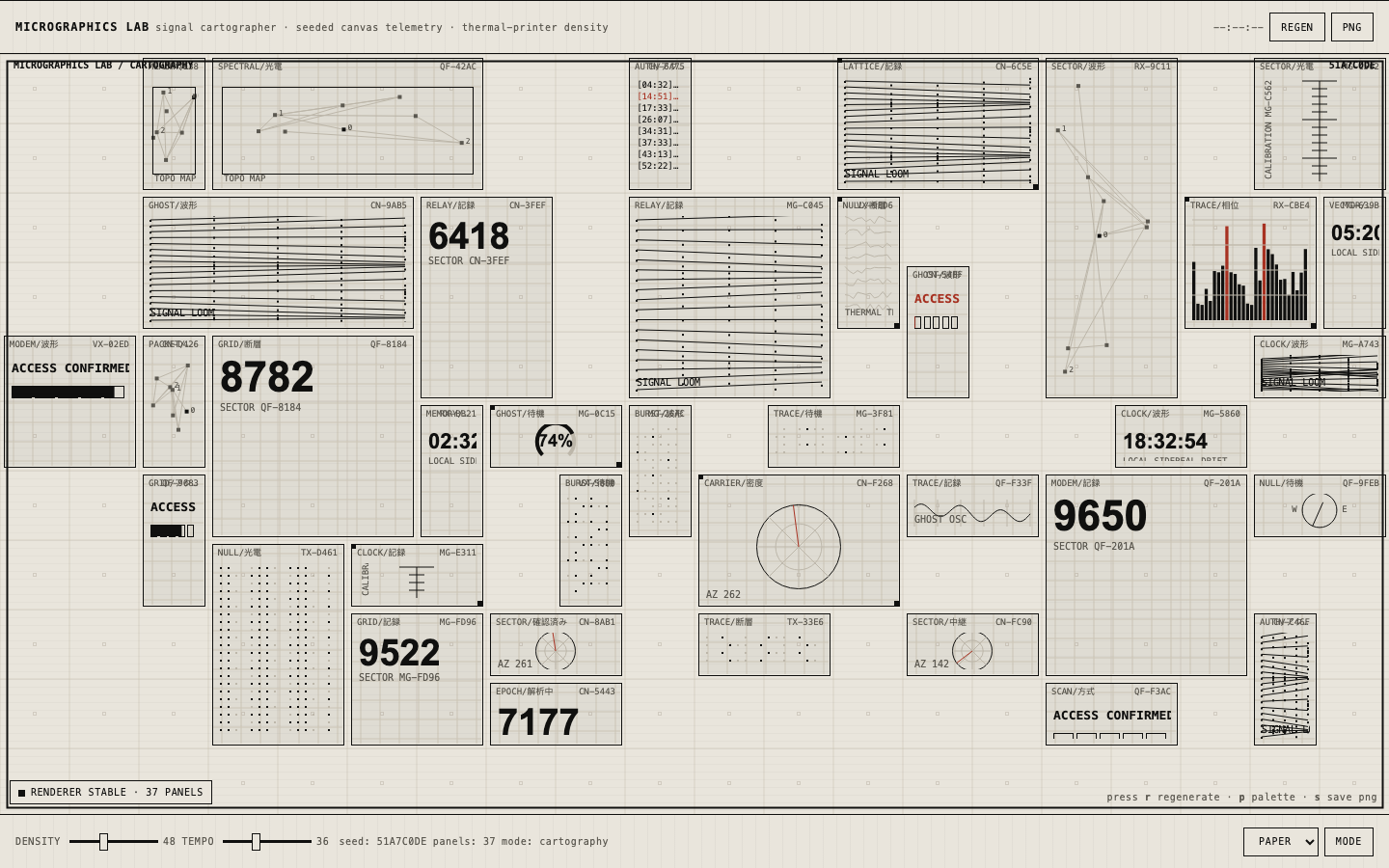
The renderer still fills a Canvas 2D surface with fictional telemetry panels, but the layout now has stronger constraints:
- Seeded randomness so panels do not mutate like a caffeinated slot machine.
- Clipped drawing regions around every module.
- Measured and shortened labels instead of trusting canvas text like a fool.
- Separate mobile composition rules with fewer panels and larger cells.
- Density and tempo controls that actually change the character of the system.
- Palette and mode switching without turning the thing into a theme picker circus.
- PNG export for stealing a good frame when the machine accidentally tells the truth.
The default state now lands around twenty-two panels on desktop and roughly thirteen on mobile. That matters. High density is not the same as dumping trash into every square inch. Density needs hierarchy or it becomes static.
The Visual Language
The target is still the same forbidden little altar: Japanese appliance LCDs, military C4I printouts, keygen-era density, diagnostic thermal paper, phreak hardware labels, and fictional signal telemetry.
The palette stays severe:
- warm paper background
- black ink foreground
- two quiet gray steps
- one red alert channel
No purple. No glow. No plastic dashboard cards. No startup “observability platform” cosplay. If it looks like a SaaS KPI screen with a monospace font slapped on it, it failed.
Design Veto, Not Decoration
The useful part of this build was not adding more panels. The useful part was letting the design process veto the default agent disease: more stuff, more labels, more tiny clever nonsense.
The project has actual design artifacts now: a DESIGN.md, component rules, anti-patterns, UX flows, and visual review notes. That sounds formal, but the point is simple: design gets authority before implementation starts making excuses.
The visual reviewer failed the first local pass for exactly the right reasons:
- too many panels
- weak hierarchy
- mobile looked overpacked
- tiny labels were flirting with bleed
- controls felt bolted on
So the build got compressed and calmed down. Larger mobile cells. Fewer attempts in the packer. Shorter labels. Bigger touch targets. Quieter grid texture. The machine still looks busy, but now it looks busy on purpose.
Technical Notes
Stack is deliberately boring:
- Vanilla HTML/CSS/JS
- Canvas 2D
- No framework
- No build step
- Vercel static deploy
The core renderer follows three rules that should be tattooed on anyone building generative UI:
- No
Math.random()inside the animation loop. - Clip every panel before drawing into it.
- Fit text before it becomes evidence of negligence.
Animation is ambient, not performative. Waveforms breathe. Gauges drift. Radar lines sweep slowly. Status LEDs pulse. Nothing jitters just to prove JavaScript is running.
Why This One Works Better
The first micrographics build chased the look. This one respects the failure modes.
Micrographics are seductive because they reward zooming in. That seduction becomes cheap when everything is equally loud. A believable machine needs quiet zones, anchors, and constraints. It needs some panels to be important and others to recede into texture.
That is the difference between a fake HUD and an interface that feels like it came from a device someone might actually misuse.